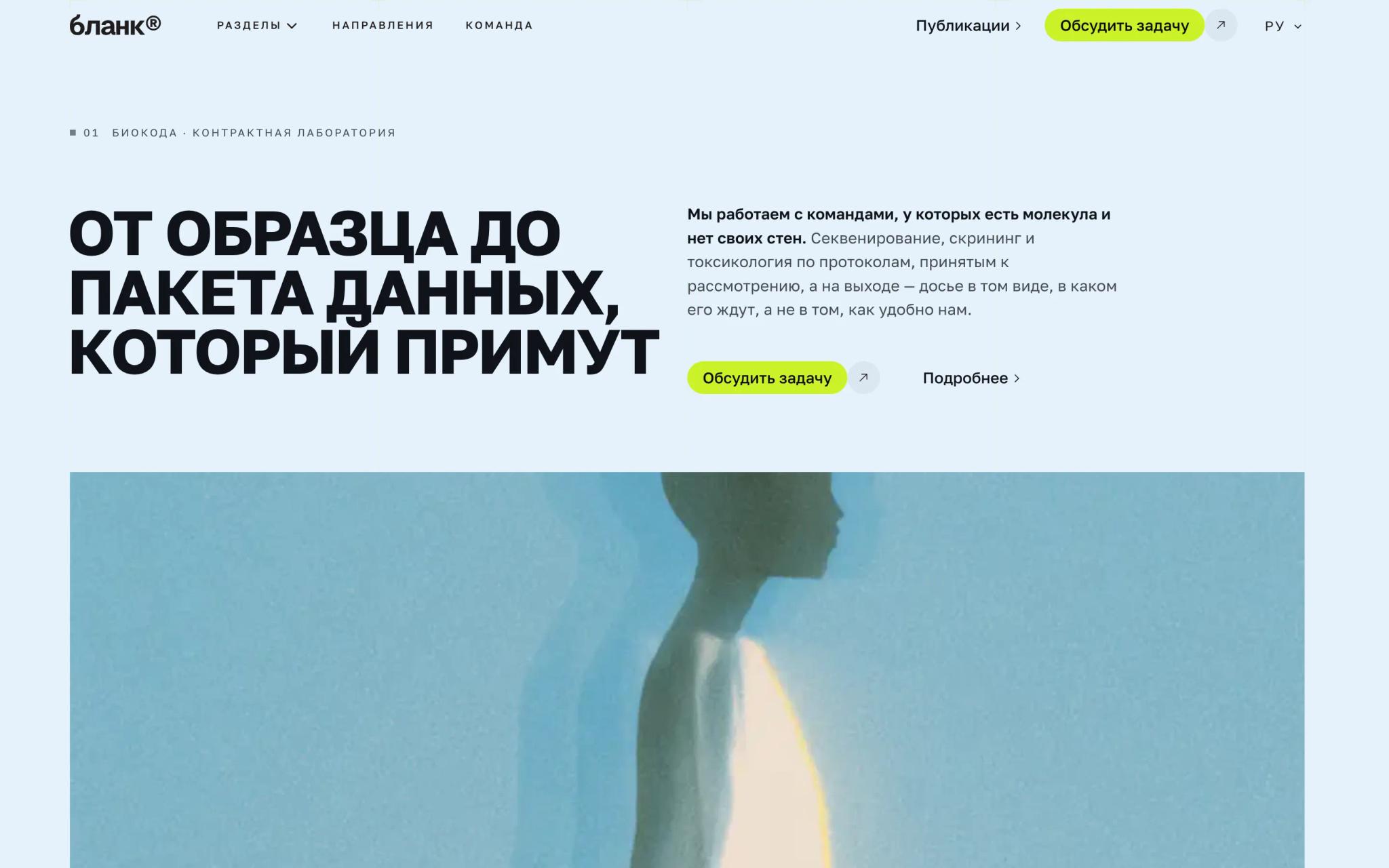
Свет: сайт студии брендинга
Четвёртая из шести. Единственный случай в этой серии, где сайт и есть работа: студию нанимают по тому, как выглядит её собственная страница.
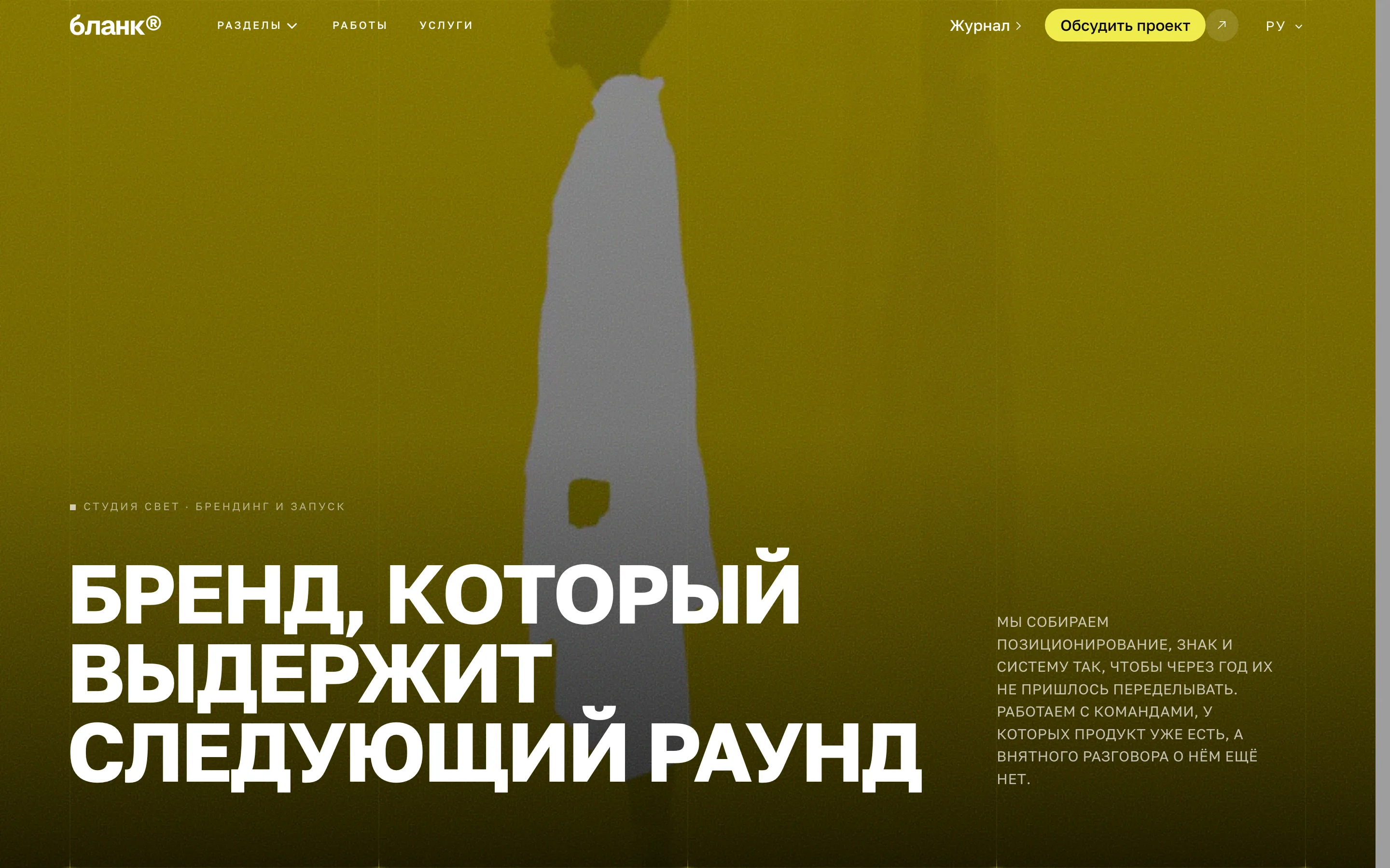
Свет — студия брендинга и запусков. У такого заказчика сайт работает не как витрина, а как образец: посетитель не читает, что студия умеет, он смотрит, умеет ли.
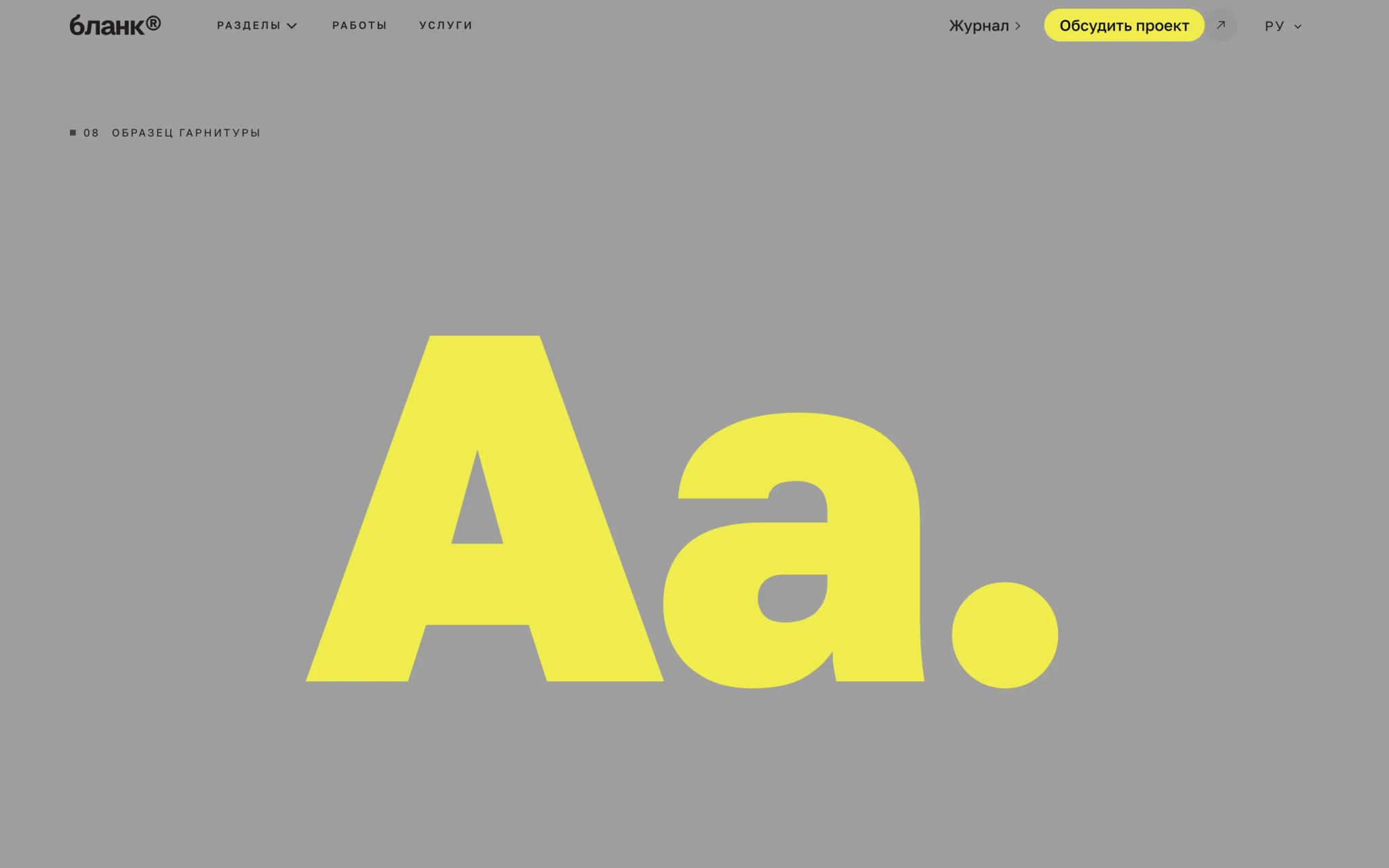
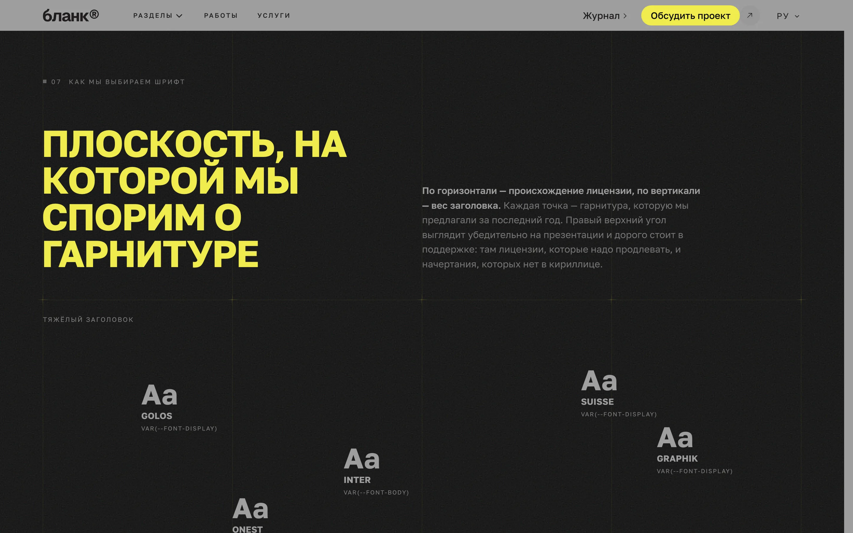
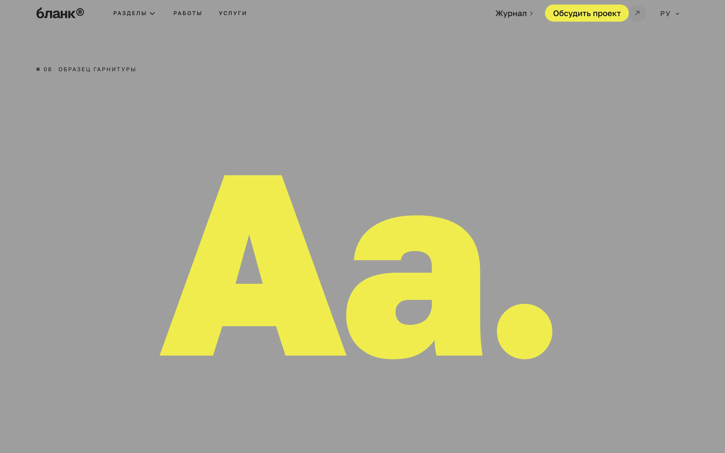
Отсюда состав. `MediaHero` открывает страницу кадром во всю ширину. `SpecimenShowcase` и `TypeSpecimenMap` — две секции про шрифт: первая показывает гарнитуру как образец, вторая раскладывает начертания по плоскости. Для студии это не украшение, а предъявление ремесла.
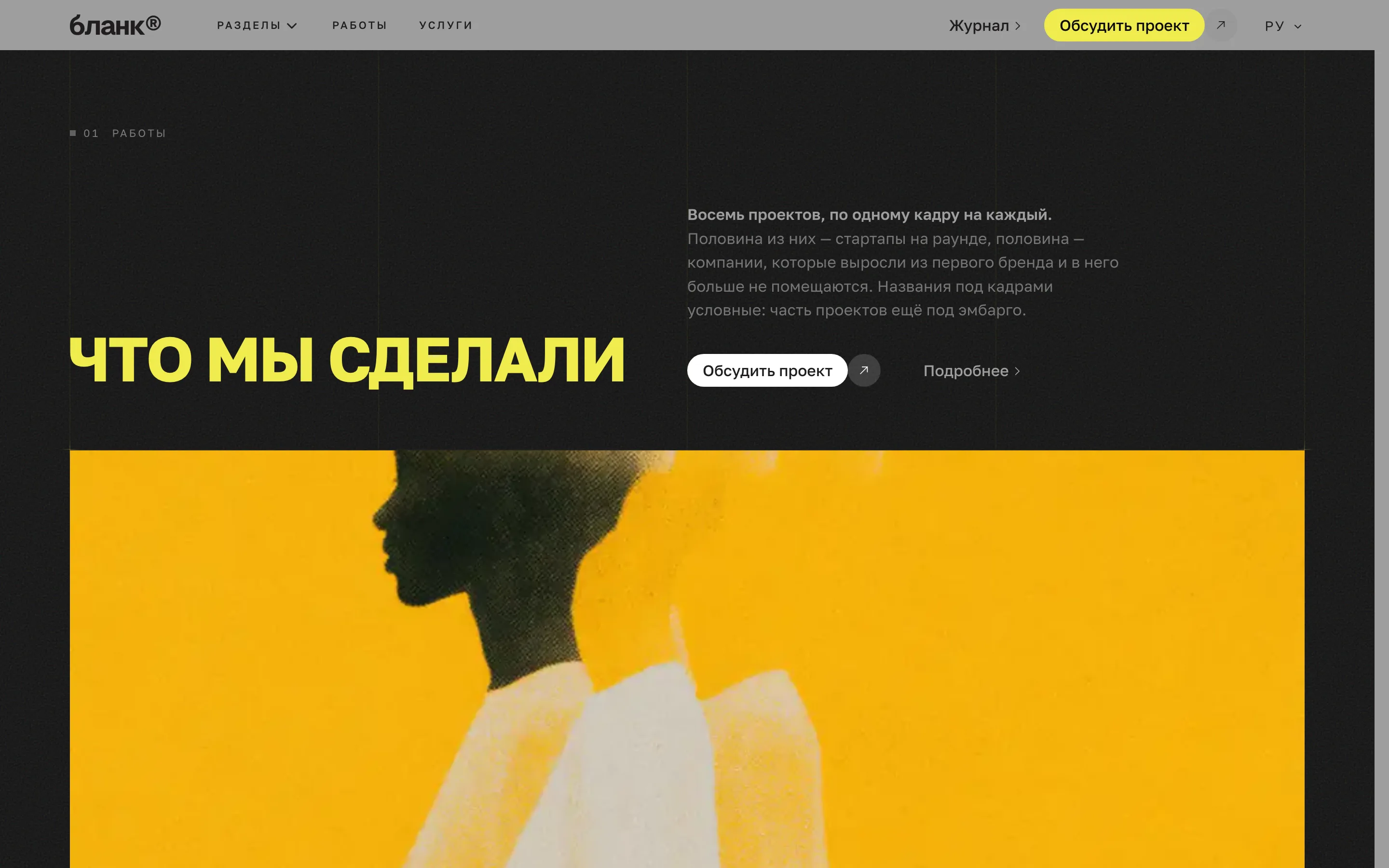
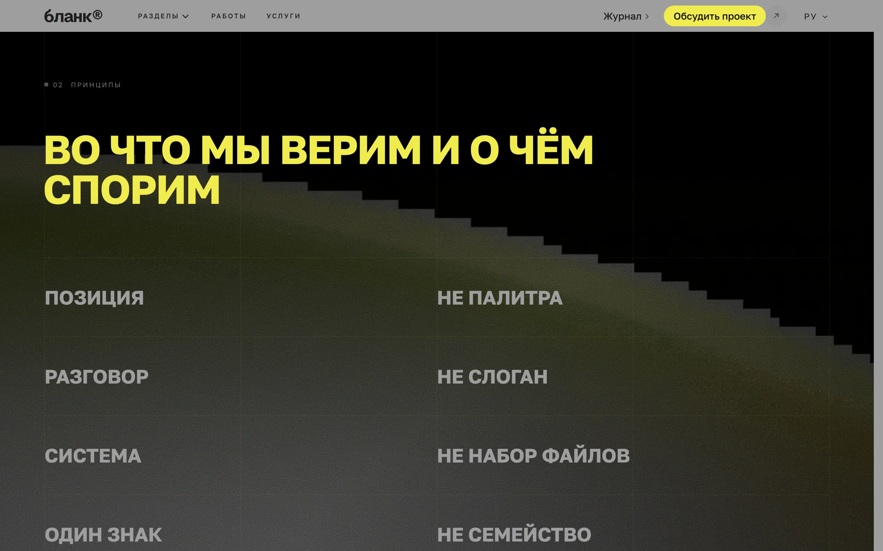
`TypoScroll` даёт список крупным кеглем, где строка подсвечивается под курсором, а рядом всплывает кадр. `ParallaxSlideshow` показывает работы лентой. Обе секции существуют ради одного — чтобы страница двигалась так, как двигаются работы студии.
Жёлтый, которым нельзя писать
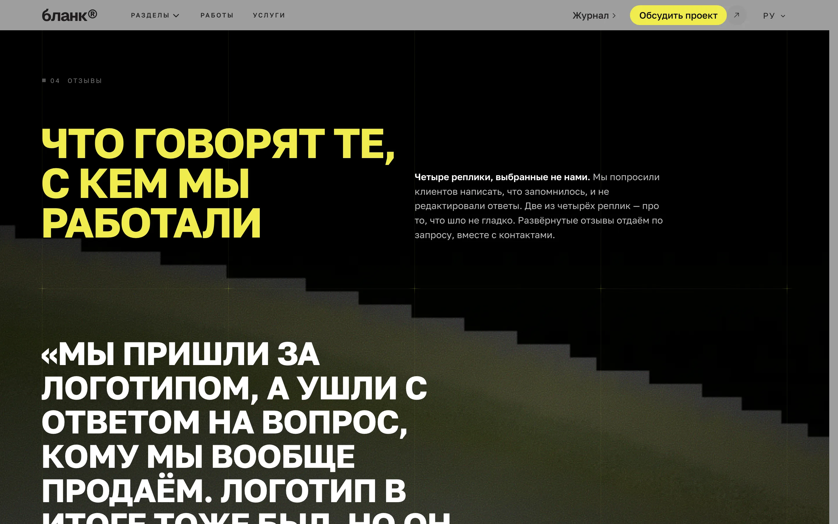
Праймери здесь ядовито-жёлтый, и это ловушка: текстом на светлом фоне он не читается совсем. В шаблоне цвет заголовков и цвет бренда — разные переменные, поэтому жёлтый ушёл в подсветку заголовков на тёмном, а сами тексты набраны почти чёрным по серому.
Это и есть то, ради чего в шаблоне семь цветовых токенов вместо одного «акцента». Один цвет на все роли — самый быстрый способ получить нечитаемую кнопку и заголовок, который видно только на макете.
Что видно на этой сборке
Дисплейная гарнитура — узкий гротеск в верхнем регистре, текстовая — округлая и спокойная. `LifeStories`, `PromoCards` и `PullQuotes` заканчивают страницу: истории, предложения, цитаты. Ни одной секции с числами: у студии их нет, а выдумывать нечего.
Ещё в блоге
Две, не больше. Более длинная лента превращает конец статьи во вторую индексную страницу, а читатель уже сделал выбор один раз.