Biocoda: a site for a contract laboratory
Third of six. A contract lab is a product with no visual form: no screen, no box, only a protocol and a date.
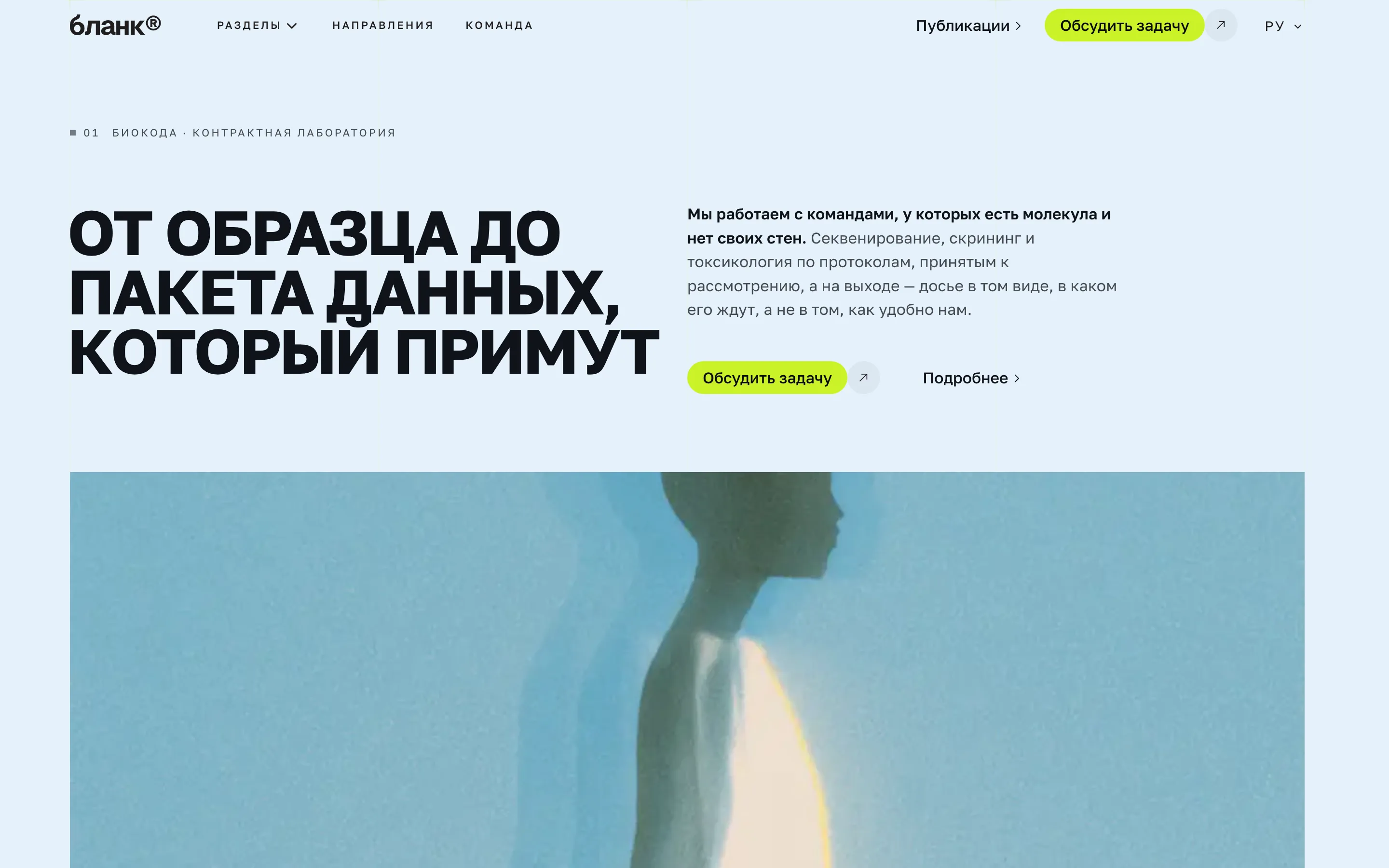
Biocoda runs assays to order: a sample arrives, a report leaves. There is nothing to show — no interface, no packaging, and photographs of test tubes look the same in every laboratory on earth.
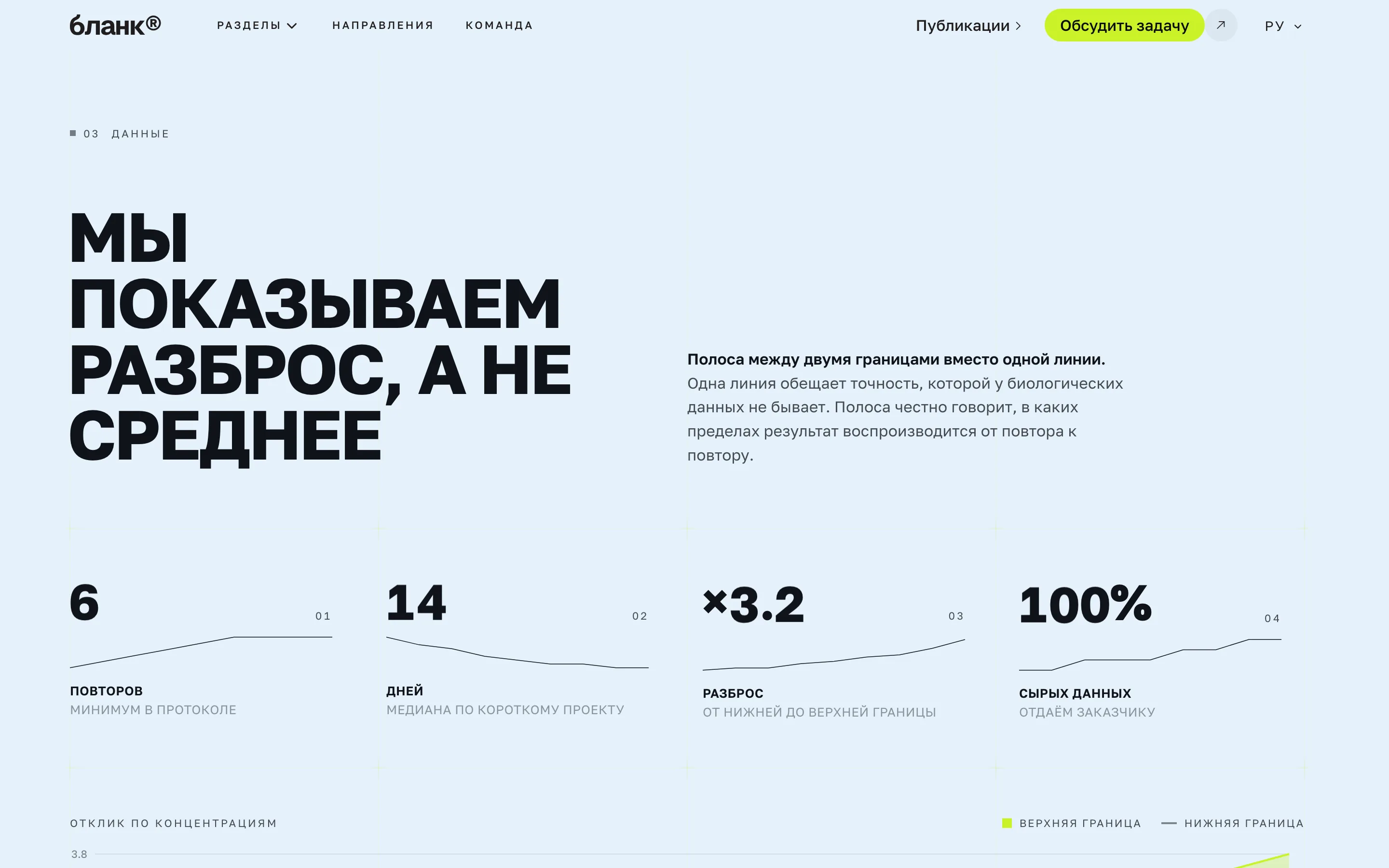
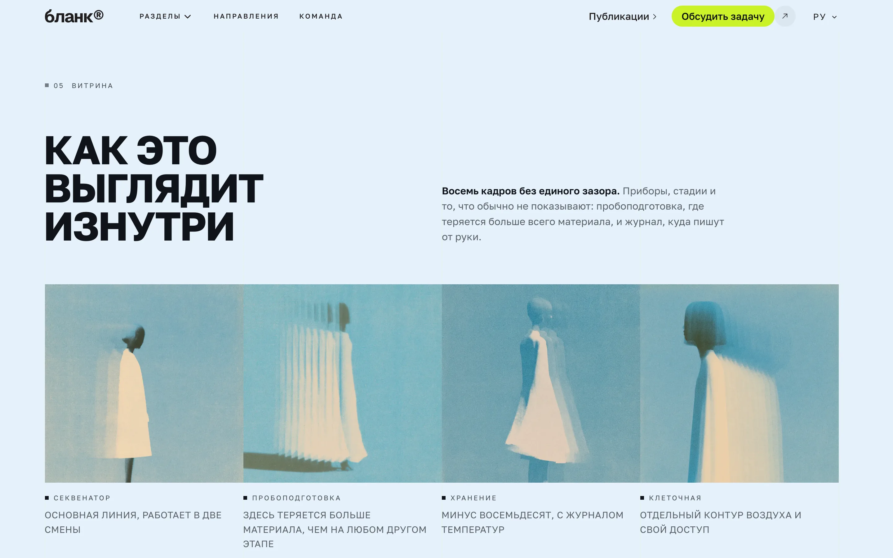
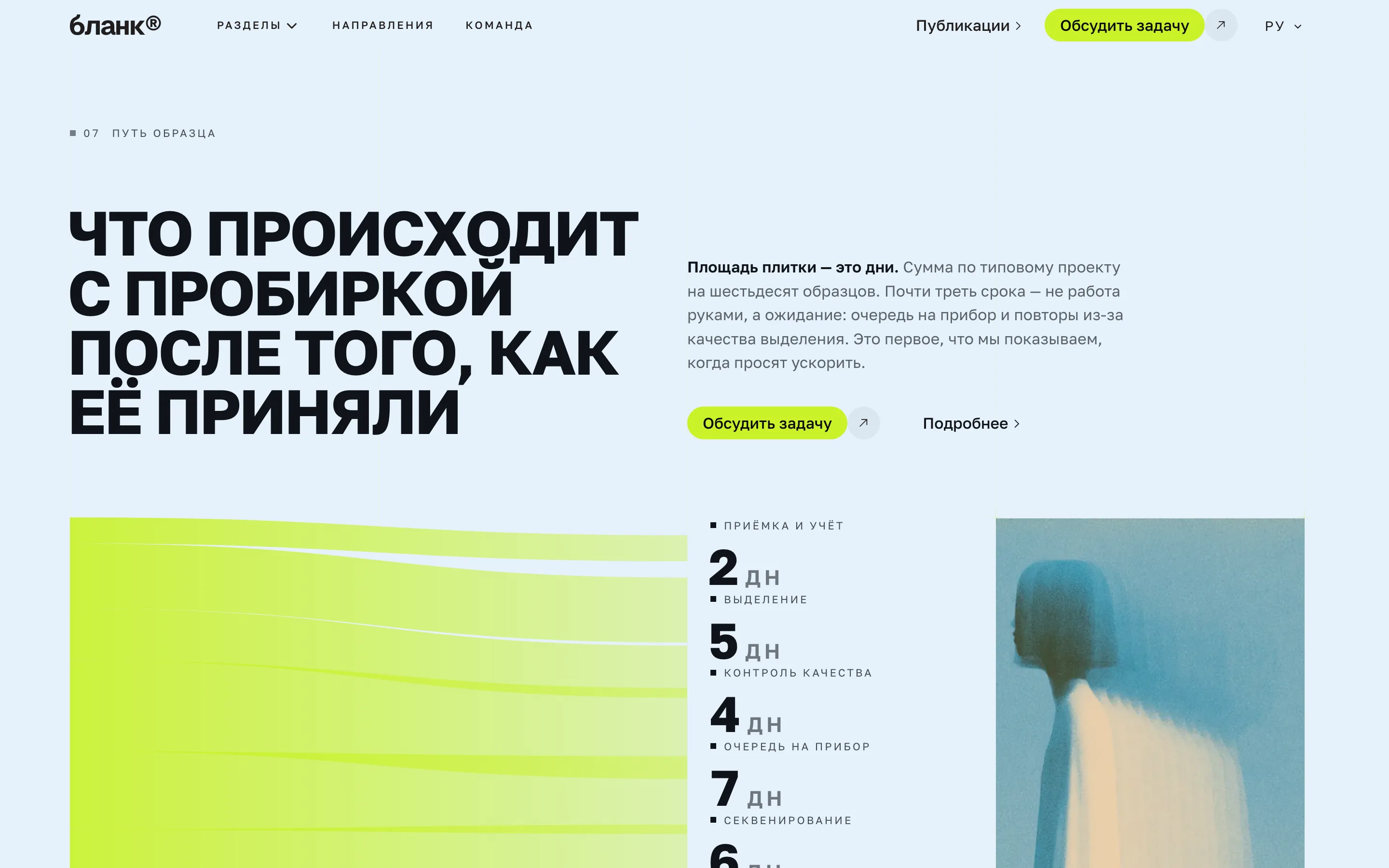
So the build rests on schemes and comparisons. `StatementHero` opens the page with a claim instead of an image. `SchemeOverview` draws the path of a sample through the lab, `FlowPanel` what happens to the data once the instrument is done. `RangeChart` shows the spread of values: for a laboratory that is the product — not the average, but how narrow the corridor is.
One comparison instead of ten arguments
In the middle sits `BeforeAfterSplitSlider`, a curtain between two states of the same image. For a lab it is the most substantial section on the page: it shows the difference the client is buying without a single adjective.
Then `ProgramCards` with the formats of work and `TeamGrid` with the people. In a service with no product, the people are the product, which is why the team comes before the prices rather than after.
What this build demonstrates
An acid lime primary on a very light blue, with near-black ink. The pair is loud on purpose: laboratory sites are usually blue and identical, and standing out in an inbox matters more than being calm.
The display face is a serif — an unusual choice for this niche — and the body face a grotesque. Changing one line of config changes both, and the headings in all thirteen sections follow.


More from the blog
Two, never more. A longer strip turns the end of an article into a second index page, and the reader has already chosen once.