Ledgera: a site for payment infrastructure
The second of six demos. Payment infrastructure is bought on how clearly the mechanism is explained, not on how the page looks.
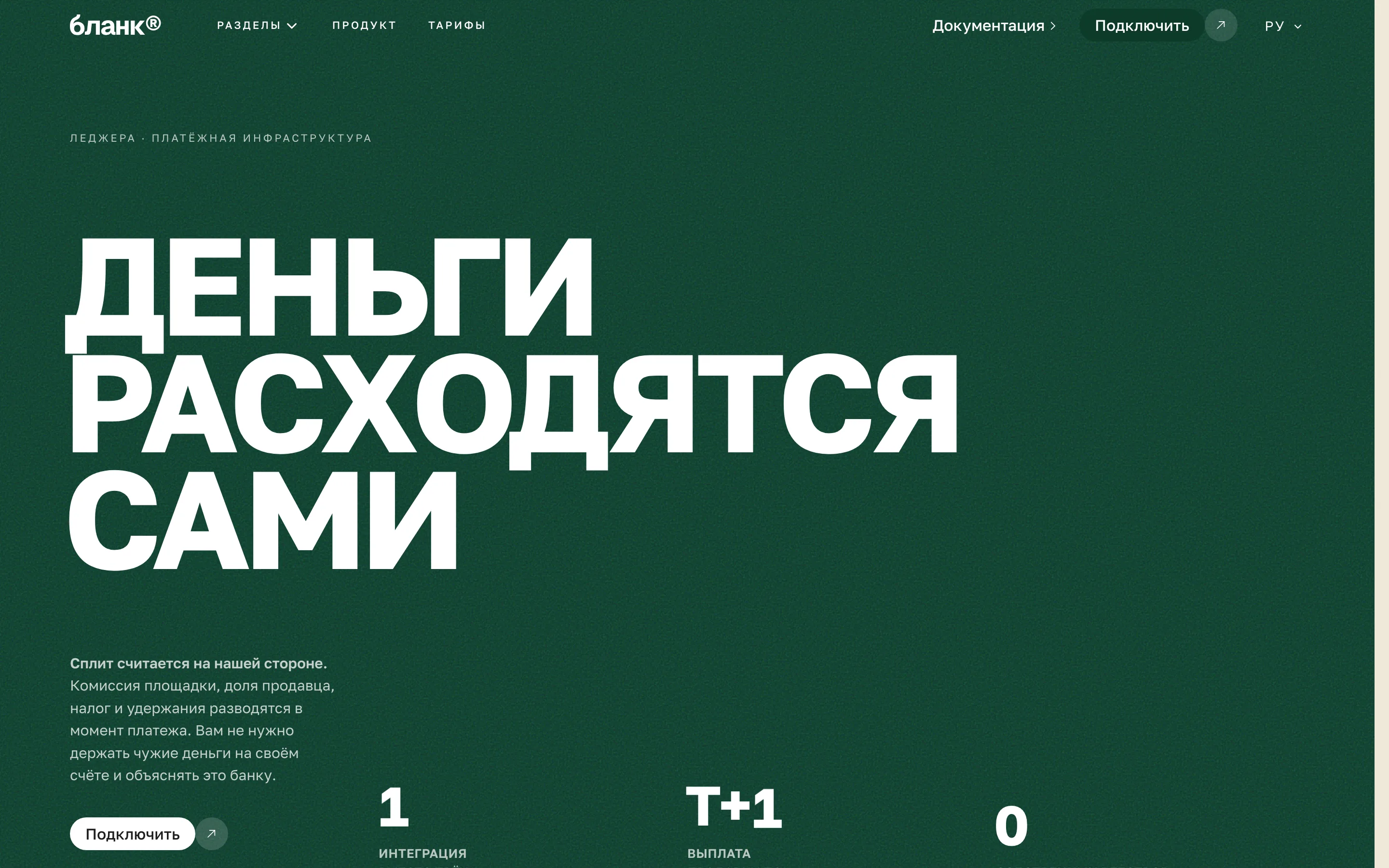
Ledgera is payment infrastructure: taking money in, splitting it, paying it out. The buyer is a technical or a finance director, and both read the page the same way — looking for the complexity that was left out.
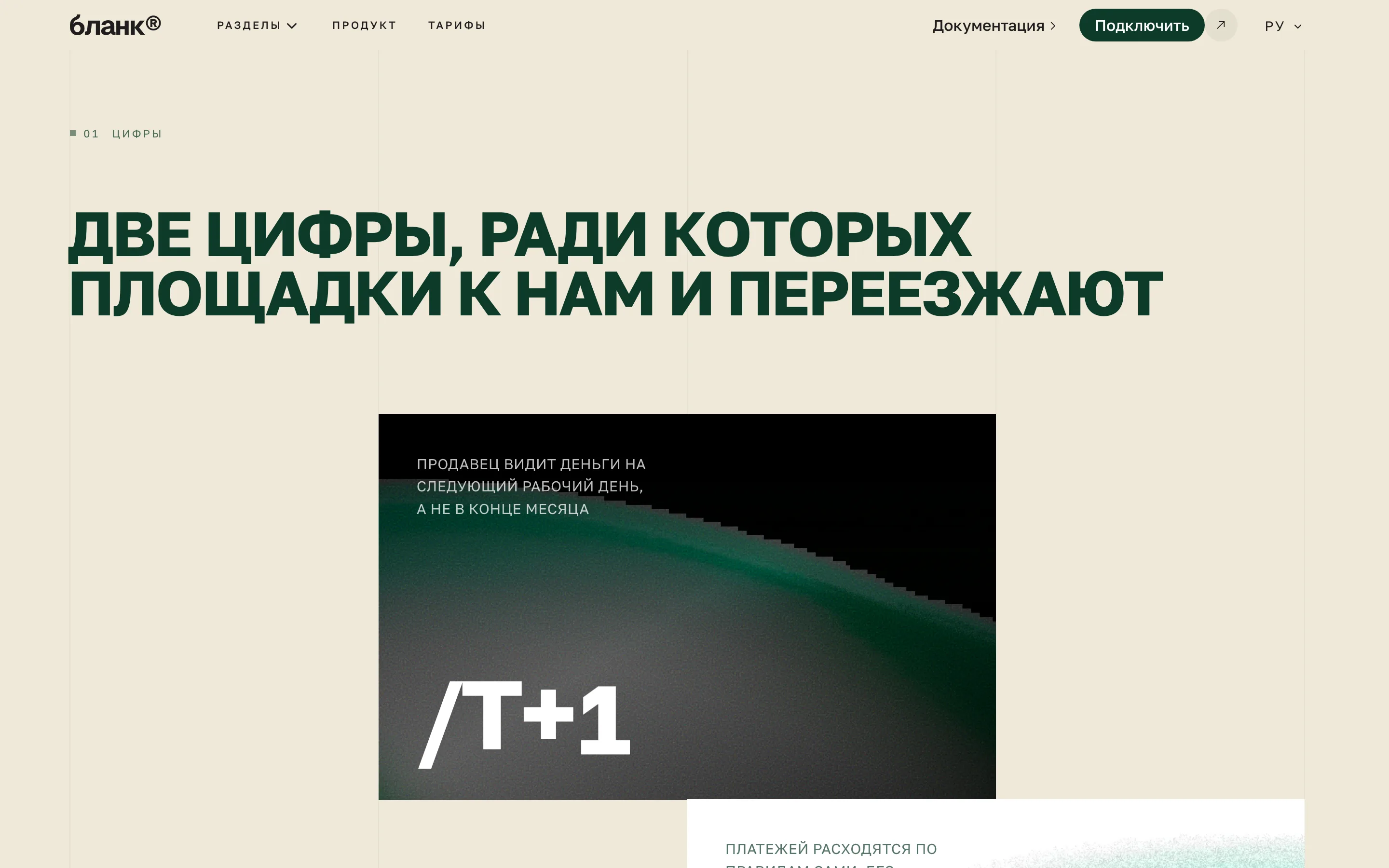
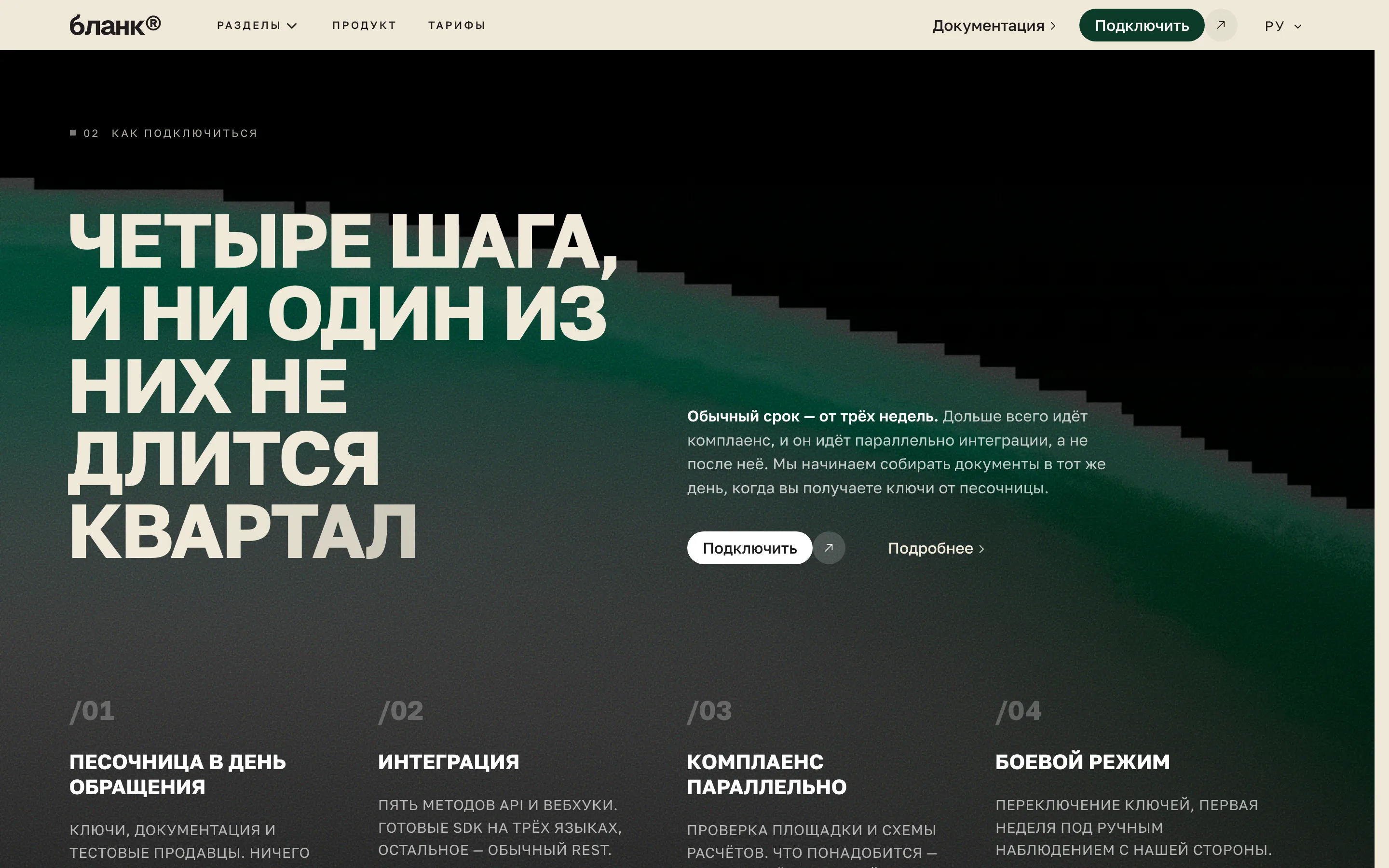
So the whole build is arranged around explaining the mechanism rather than promising an outcome. The first screen is `FloodHero`, the brand colour flooding the viewport: deep green with white text on it, the contrast computed rather than eyeballed. Then `ProofTiles` — tiles carrying what can be checked — and `NumberedSteps`, where the path of a payment is laid out step by step.
Where the selling happens
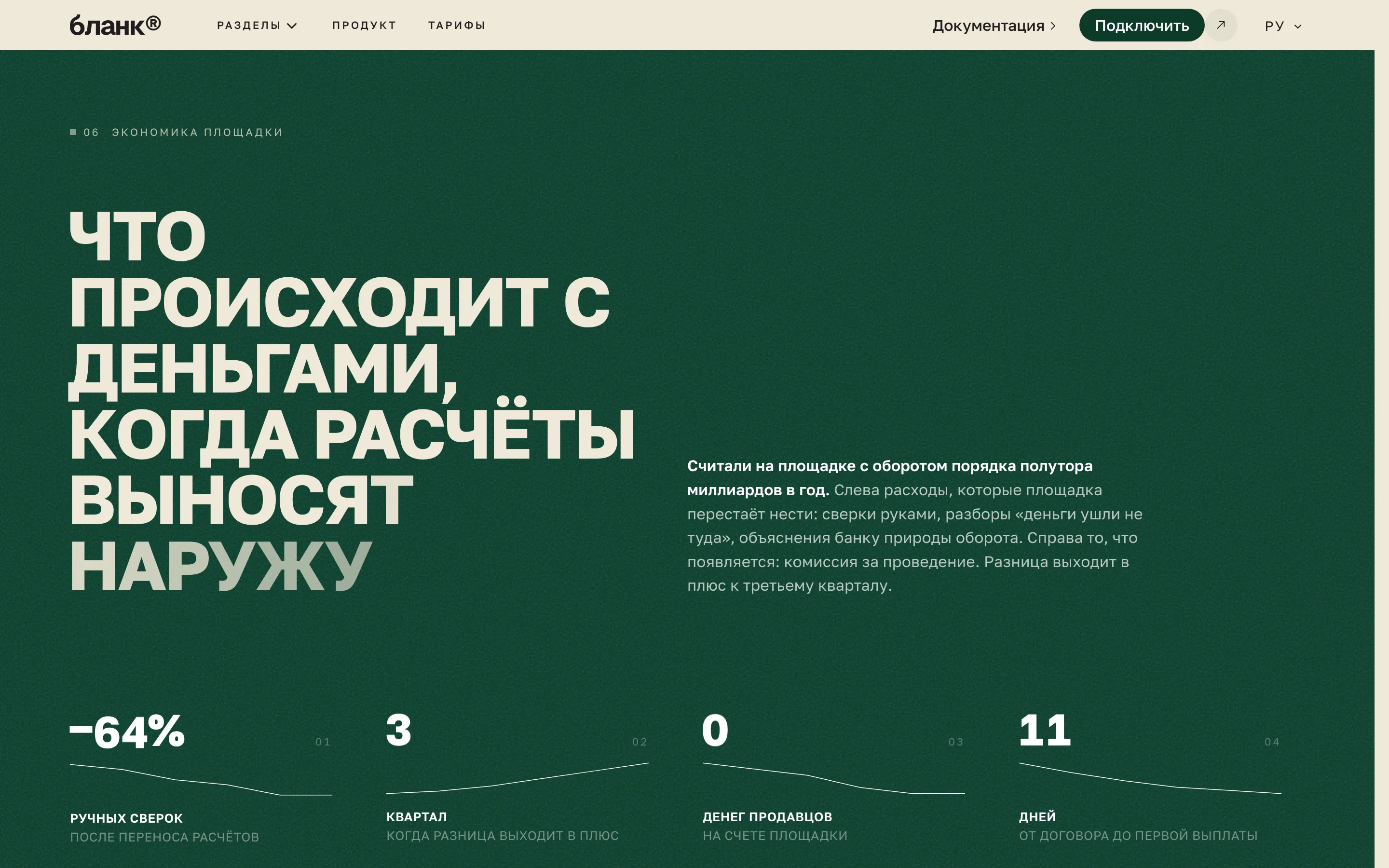
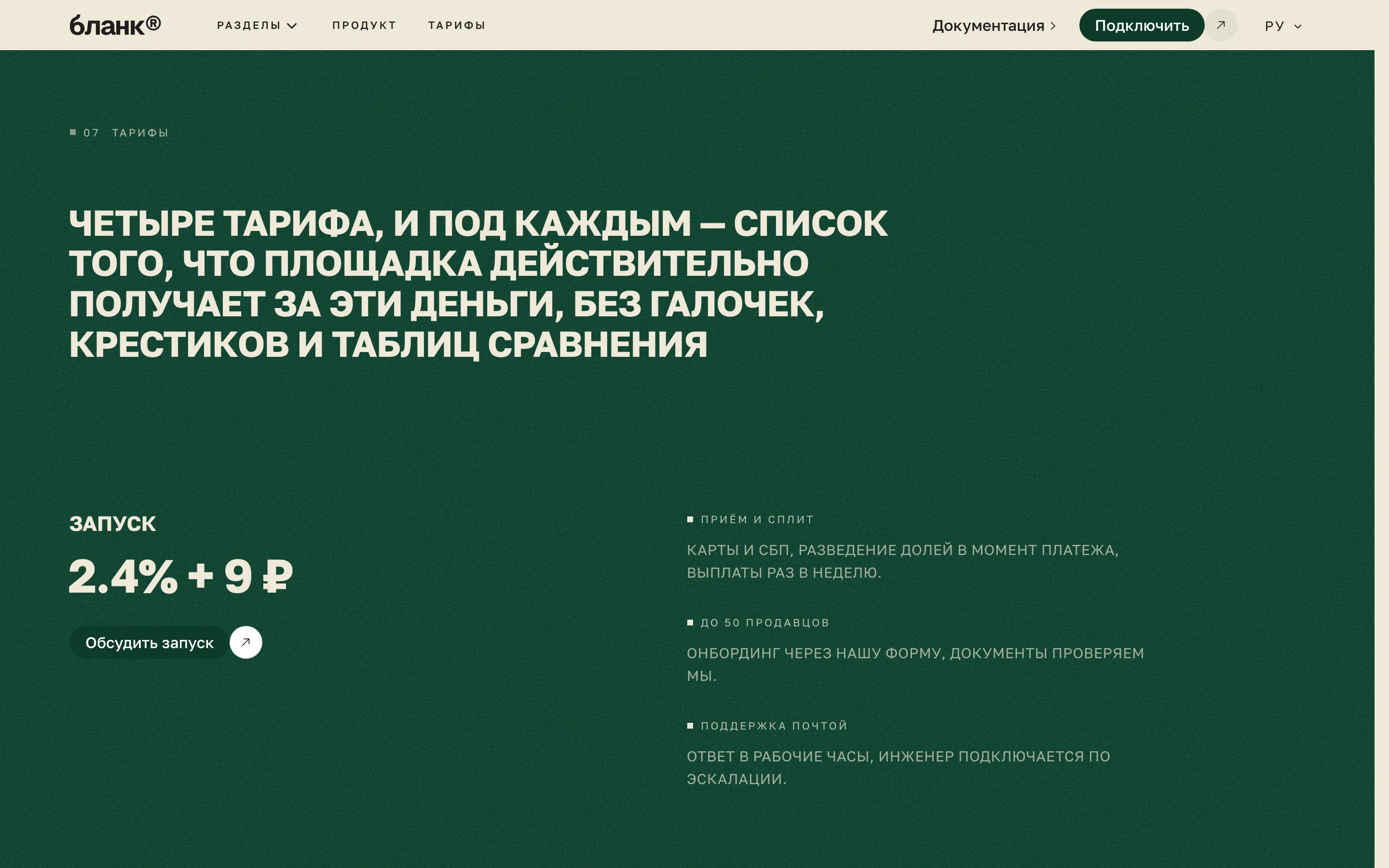
Fintech is the rare case where a price on the site helps. Not knowing the price reads as "expensive, by arrangement", and that turns away exactly the people ready to pay today. So the build carries `PricingPlans` and `FinancialModelSlide` — a slide showing what the cost of processing is made of.
Beside it sits `PositioningMap`: a plane with two axes and the product placed against the alternatives. It is not a map of anywhere; it is a map of the choice, and the most honest way to answer "how are you different" without naming competitors.
What this build demonstrates
A dark green primary on a warm sand surface — a palette with nothing default-fintech about it, which is the point: the page does not look like another blue dashboard. The display face here is wide, the body face narrow and quiet.
A `StatementBleed` in the middle breaks the rhythm with one full-width claim. It is an expensive device: it works exactly once on a page, and it is used exactly once here.

More from the blog
Two, never more. A longer strip turns the end of an article into a second index page, and the reader has already chosen once.