Neurocast: a site for a medtech startup
The first of six demos built with the skill in one run. A medical startup is the most awkward client a marketing site can have: nothing may be promised.

Neurocast is predictive diagnostics: a model watches a stream of measurements and says whose risk will rise before a person notices. A site for that product exists for exactly one purpose — to get a clinician or a buyer into a conversation while promising nothing.
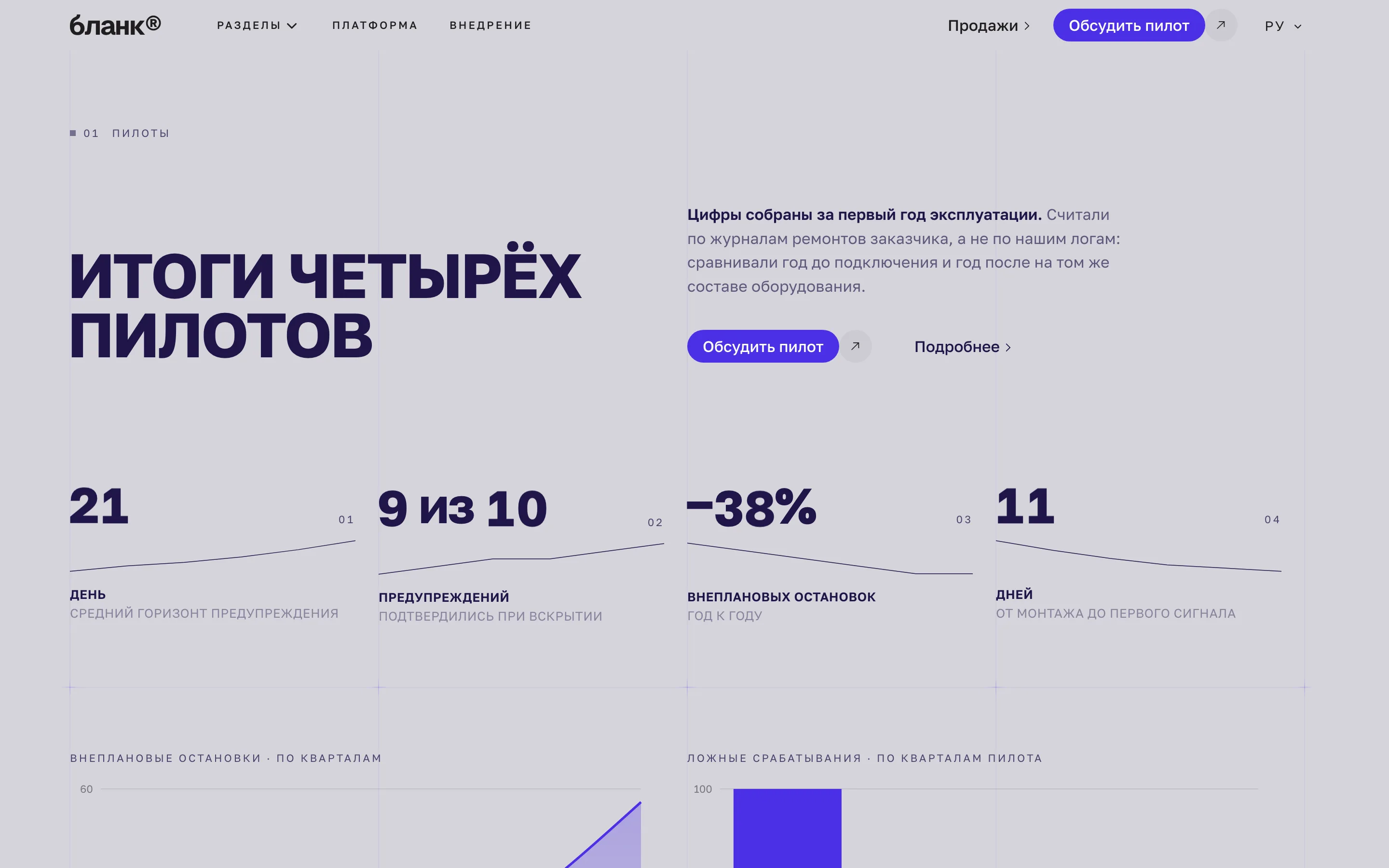
That is what makes medtech awkward. Any number on the page — accuracy, bed-days saved, money saved — is either backed by a study or is advertising for a medical device, with the consequences that carries. So this build has no figure the client did not supply, and where a large number would normally sit, a sentence sits instead.
What the homepage is made of
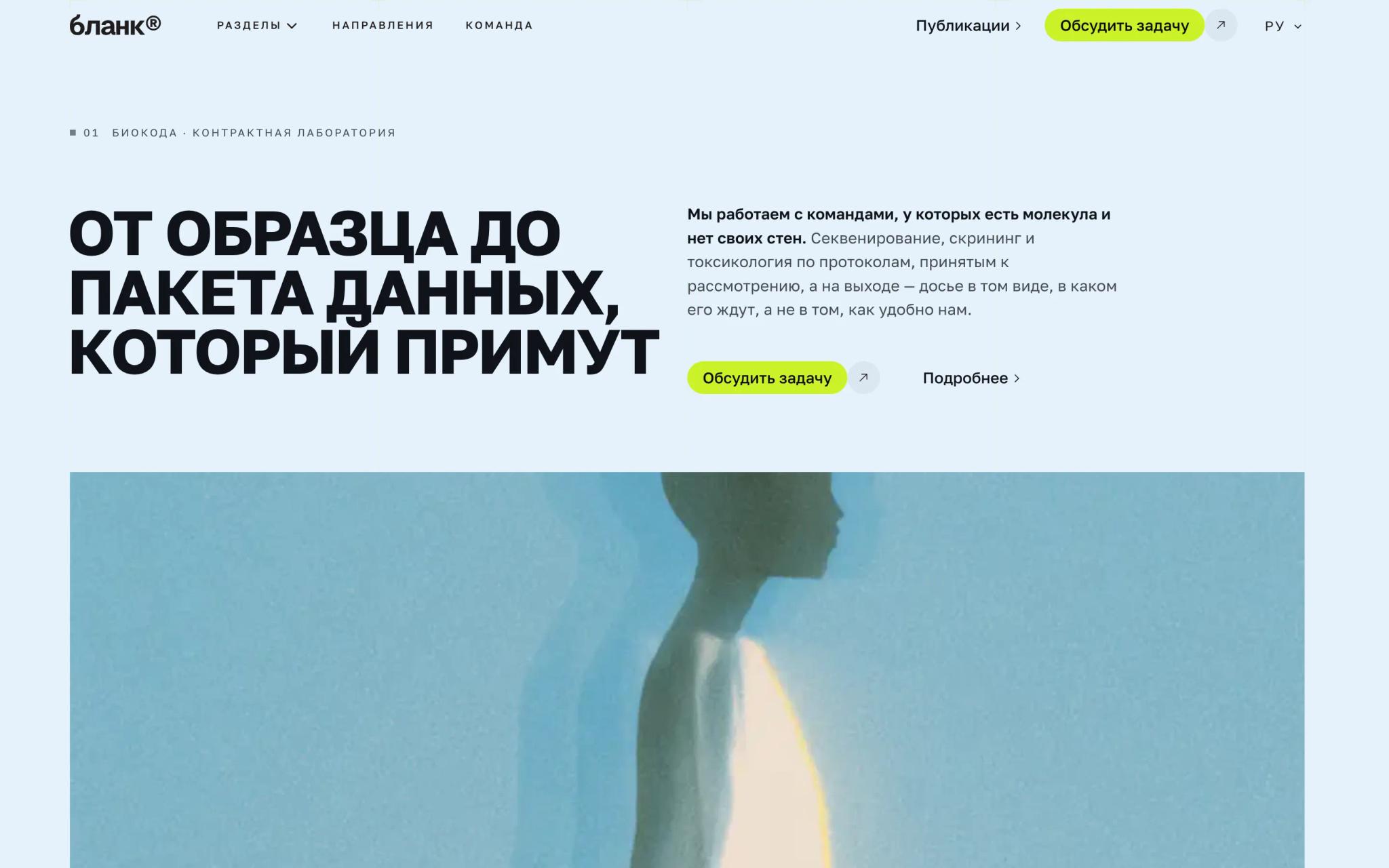
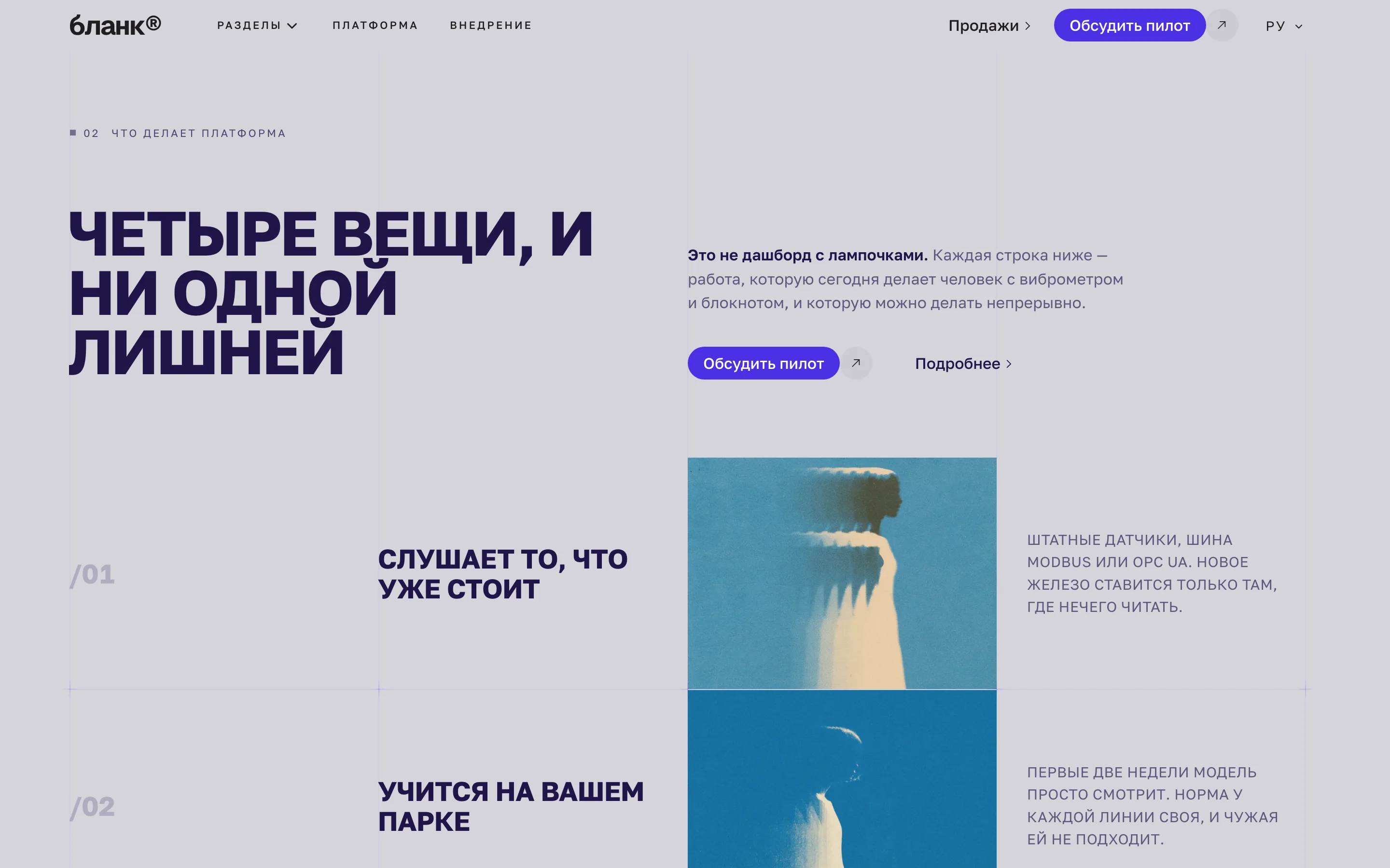
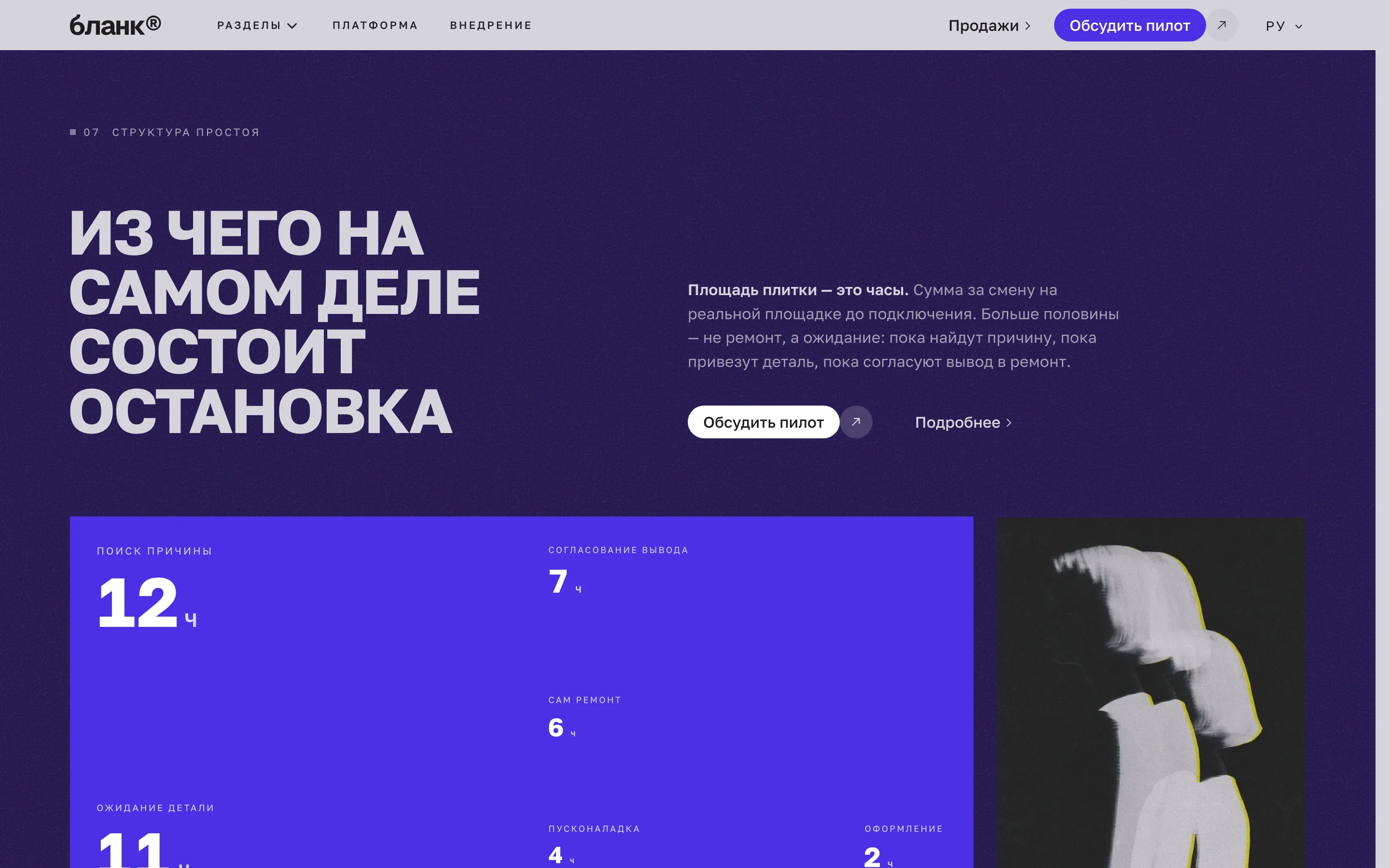
It opens with `BlendHero` — a headline over an image that fades into the page tone. Then `MetricRow`, a row of cells carrying labels rather than percentages, and `StickyStepsBasic`: four steps of the route, each with its own frame pinned to the right while the reader walks the text.
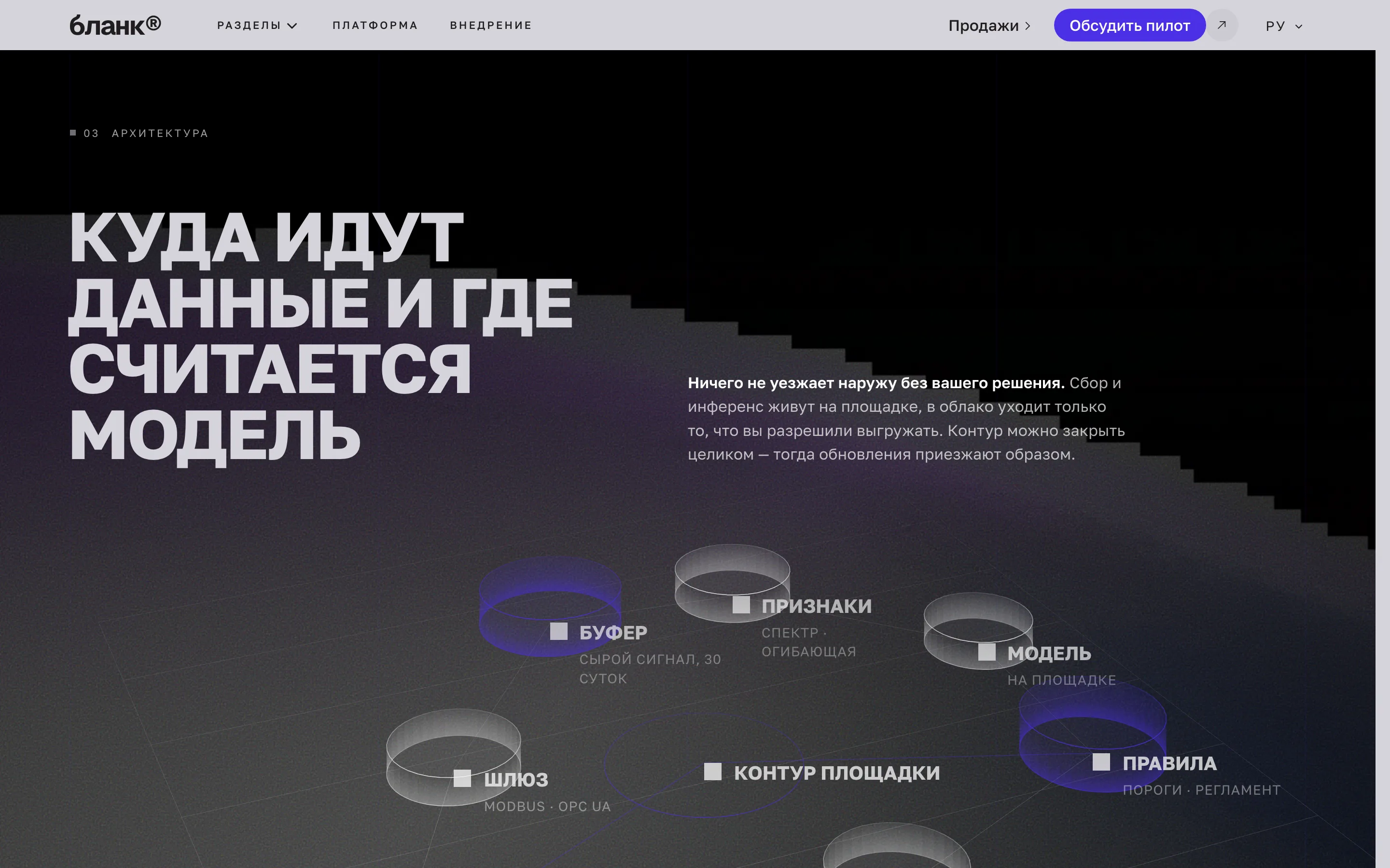
The middle is `FieldDiagram` and `TreemapPanel`: the first draws the data flow as a scheme on a plane, the second lays the sources out by area. Both carry the same idea — data arrives from everywhere and converges in one place — and show it instead of explaining it.
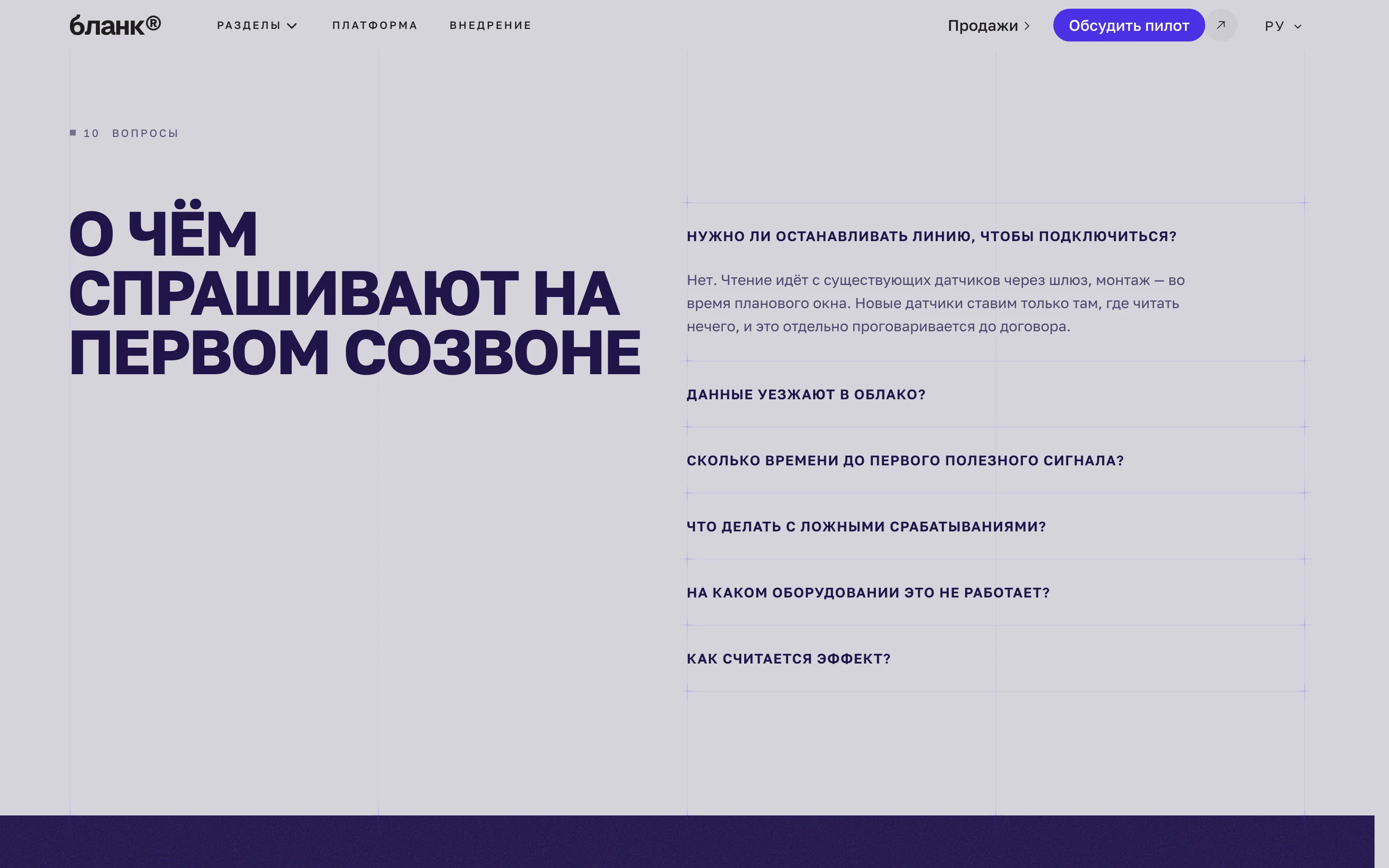
It closes with three blocks of trust in a row: `QuotePortrait`, `QuoteSwiper` and `Faq`. For medicine that order is right: first a person with a name, then several voices, then answers to what will be asked anyway.
What this build demonstrates
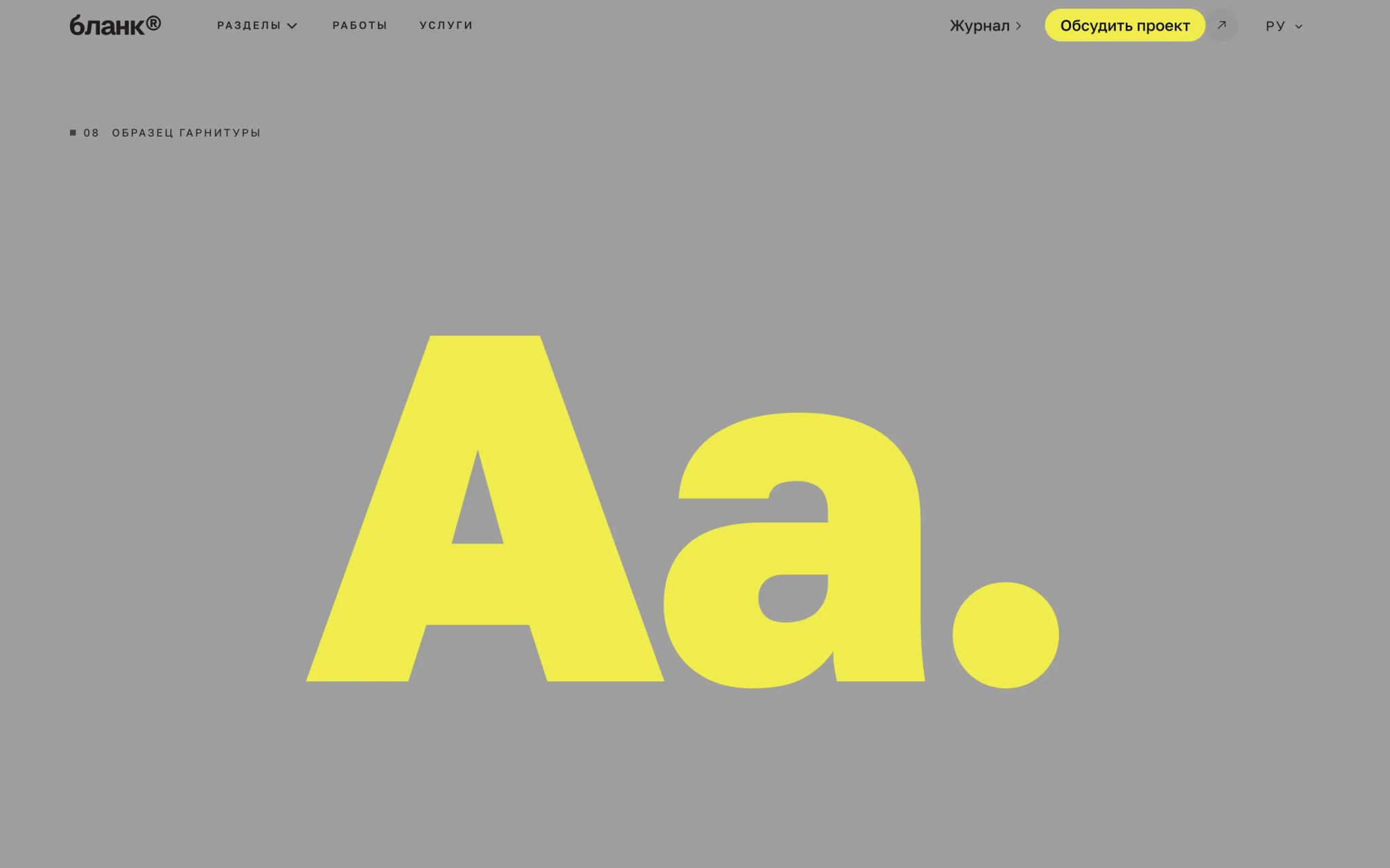
The primary here is a deep blue-violet, the surface a cold light grey. The pair was not chosen by eye: the contrast of ink on surface is computed, and the template checks it itself. Headings are set in the heavy weight of the display face, body text in a neutral grotesque; the whole site has four font variables, and no section names a typeface.
The build is complete: both themes, both languages, inner pages, a social card per route. The logo is deliberately left as the template placeholder — a demo shows layout, not somebody else's mark.
More from the blog
Two, never more. A longer strip turns the end of an article into a second index page, and the reader has already chosen once.