Polba: a site for a D2C grain brand
Sixth of six. The only dark build in the series, and the only one where the page ends in a basket rather than a contact form.
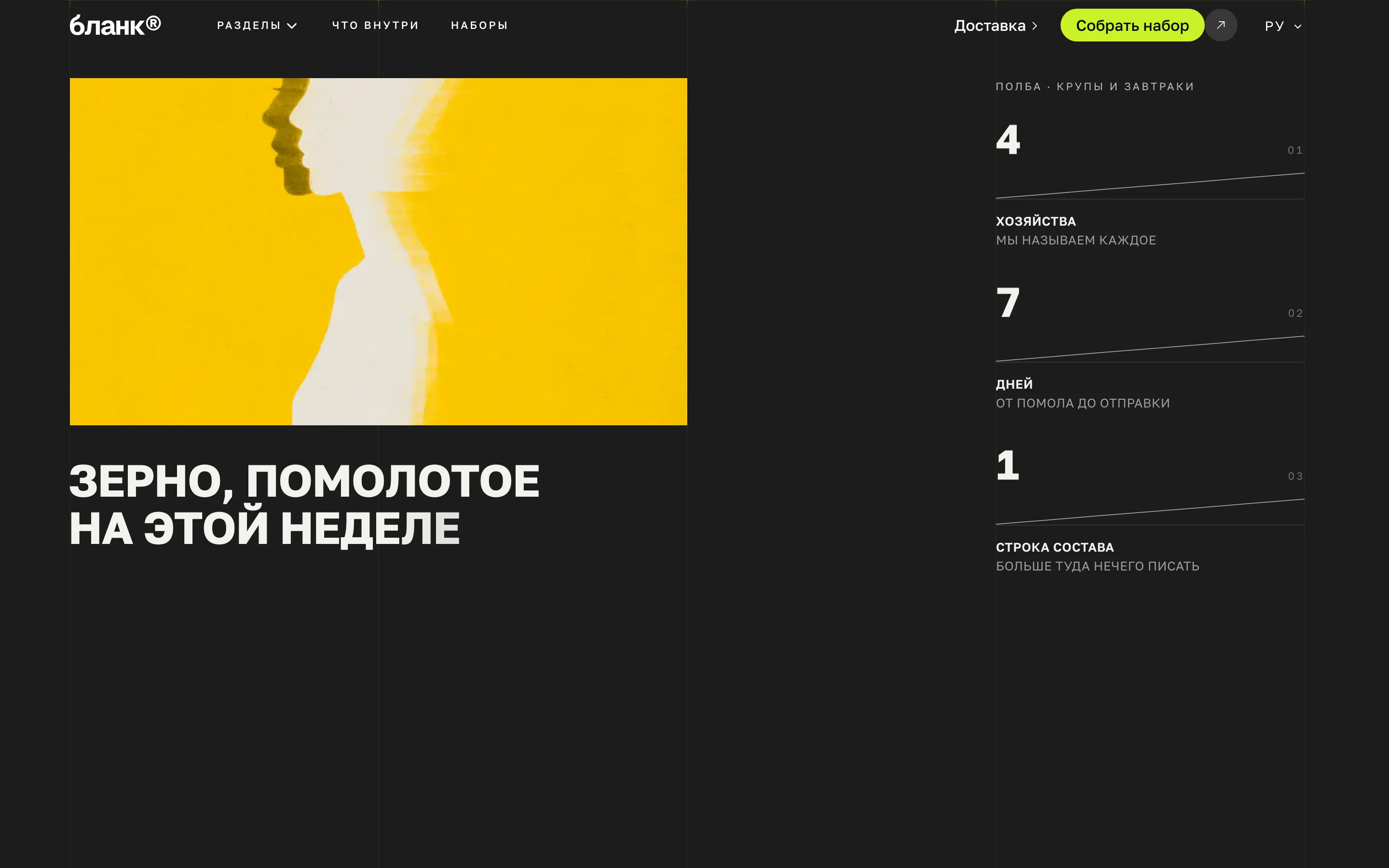
Polba is a grain brand selling direct. Food has a short path to a decision: a person either wants it or does not, and that happens on the first screen.
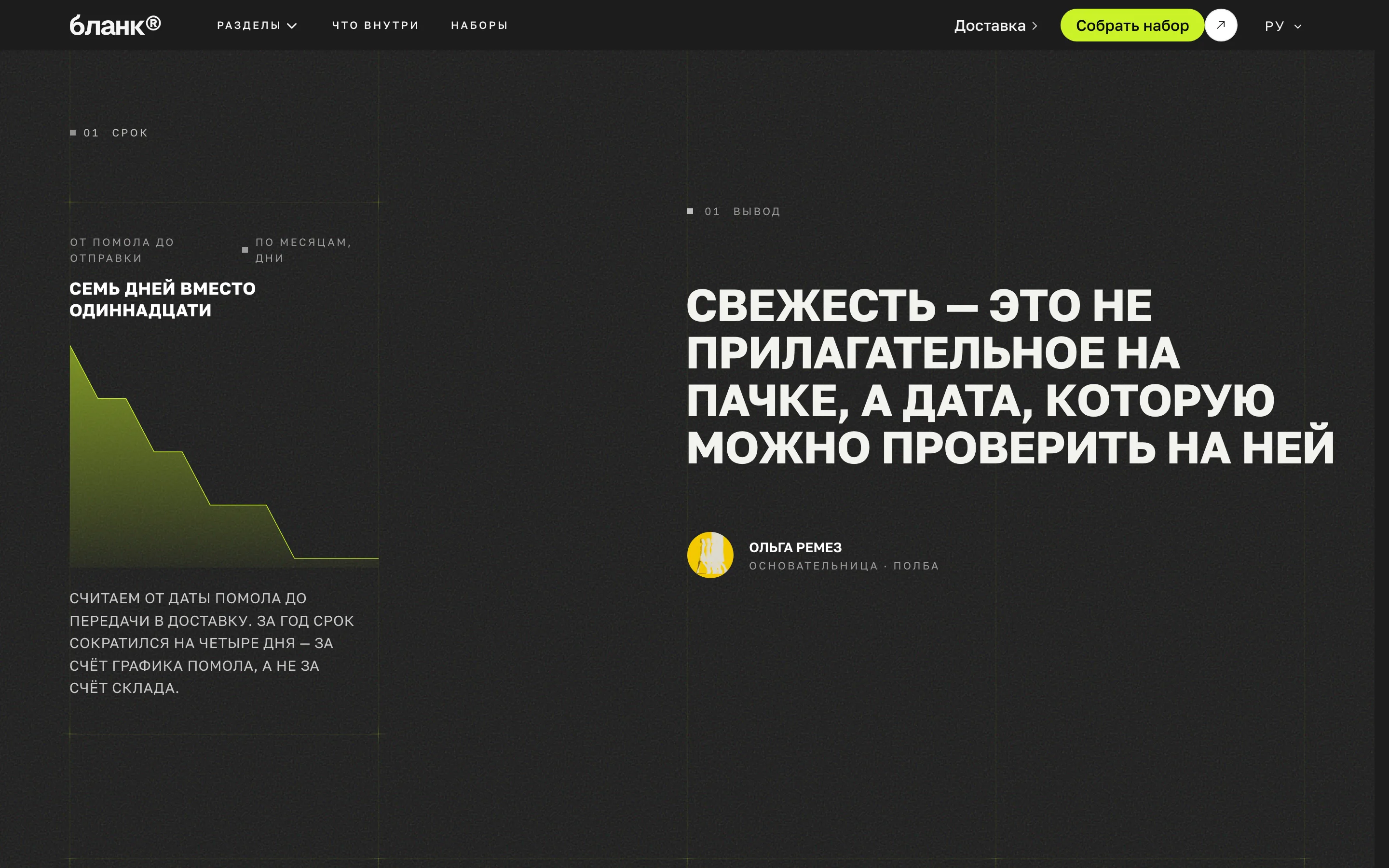
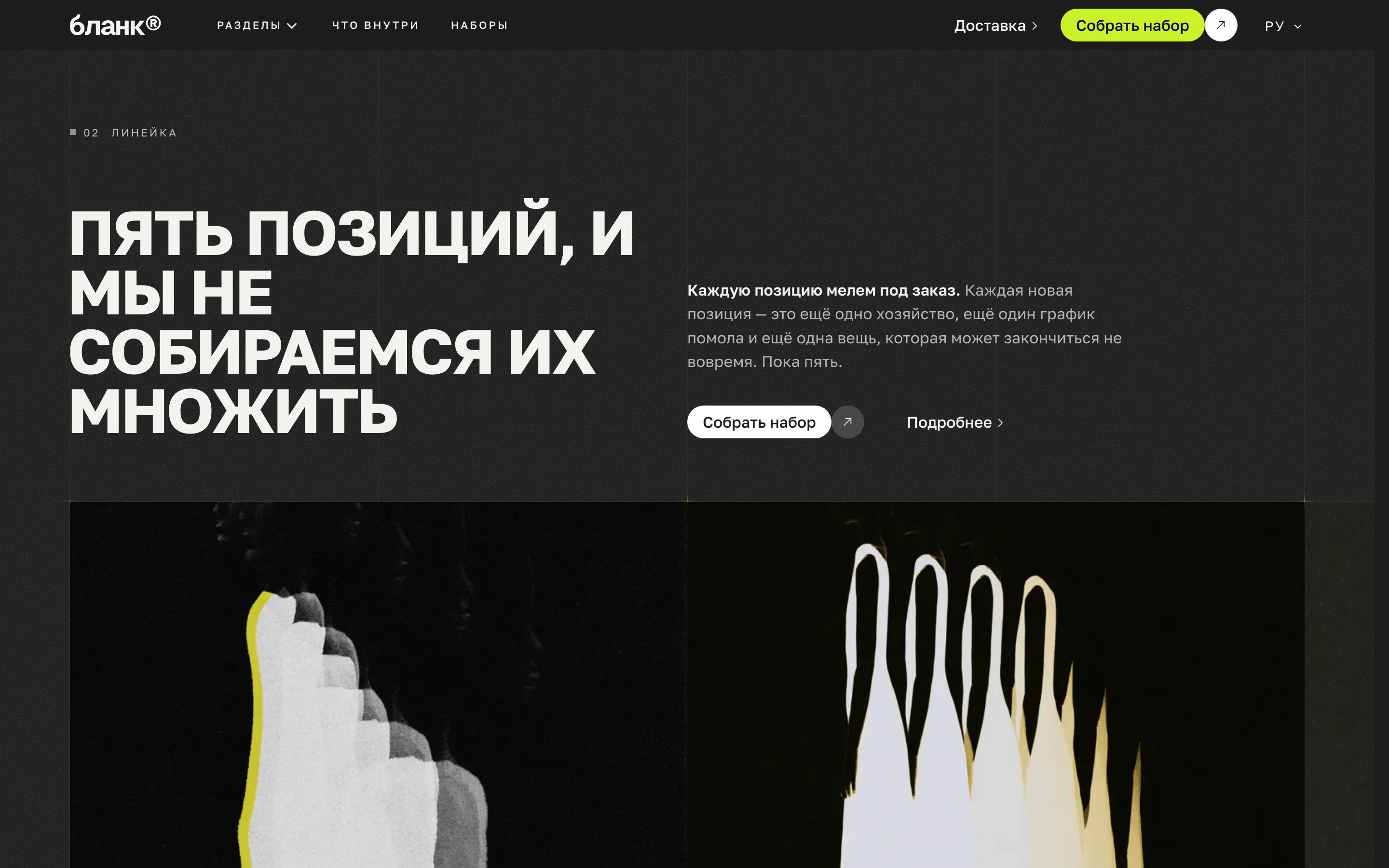
So the build opens with large photography — `MediaStack` — and moves almost at once to `Gallery` and `Summary`. Then `FeatureRows` on what is inside and `MillChart`: a milling chart, the one place on the page where production is explained with a number rather than a word. For grain that is the difference from the bag next to it on the shelf.
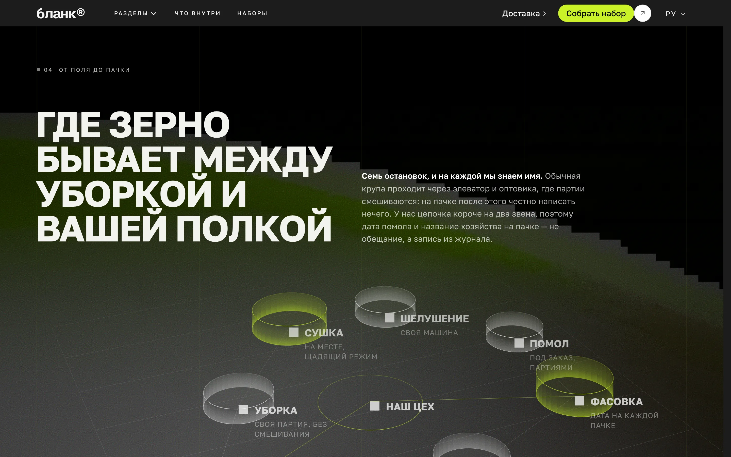
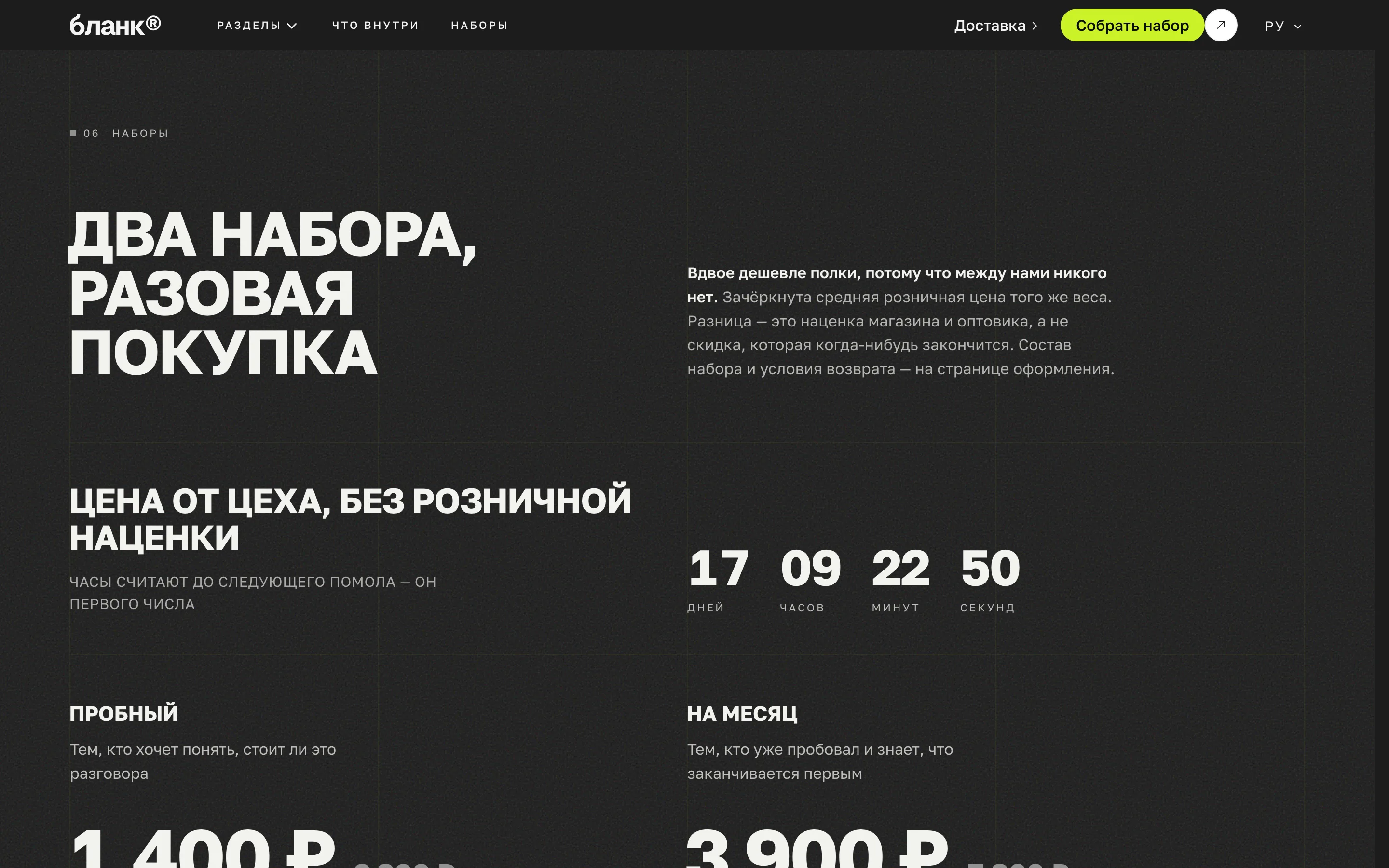
`PricingOffer` and `OfferCopy` close with the offer: price, weight, what is included. `FieldDiagram` before them shows the path from field to packet — the short chain that is exactly what D2C is bought for.
A dark site is a theme, not swapped colours
This build is dark throughout, and it is done in one line: the theme is forced dark. The temptation was the other way — swap the surface and ink colours and leave the theme light. That is wrong, and it cost us four broken sections in a row.
The reason is that a dark section in the template is not "a dark colour", it is a role: it paints ink over surface the other way round. Swap the tokens and every dark section, the footer and the form turn inside out. The rule is simple: the surface is always lighter than the ink, and a dark site is a theme.
What this build demonstrates
A lime primary on near-black — a colour that finally works as an accent on dark rather than as a mistake. The display face is tight, the body face round.
As in the other five, the logo is left as a placeholder. A demo shows how a site is built; a brand mark is separate work, and not an evening of it.
More from the blog
Two, never more. A longer strip turns the end of an article into a second index page, and the reader has already chosen once.